Instagram refreshes wordmark after decade, drawing mixed reactions
Instagram has unveiled its first wordmark redesign in a decade, with Head Adam Mosseri describing the new look as sharper and more modern while retaining links to the platform’s original identity. The change has drawn both praise and criticism from users on Instagram and Threads.
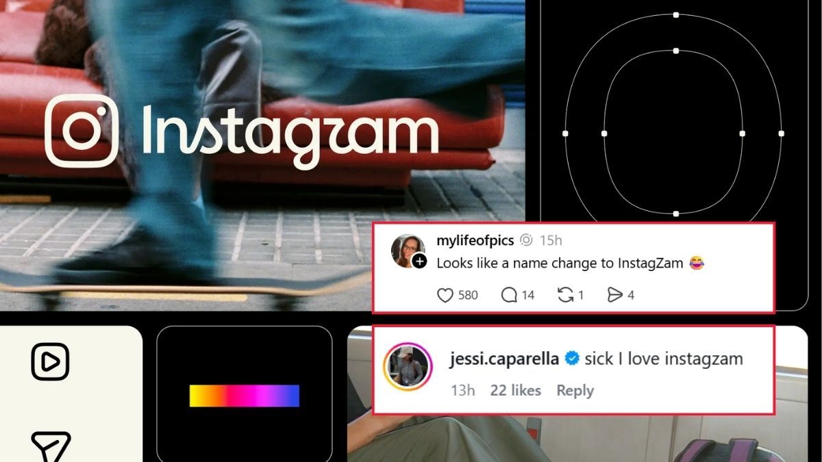
- Instagram has redrawn its wordmark for the first time in about 10 years.
- The familiar pink-and-orange camera icon remains unchanged.
- Users have split between praising the refresh and criticising its lettering and wider platform priorities.

Instagram has unveiled a refreshed wordmark, marking the first change to the design in about a decade, as the platform seeks to give its visual identity a sharper and more modern appearance.
Head of Instagram Adam Mosseri announced the update on both Instagram and Threads, saying the wordmark at the top of the app had not changed in 10 years and that it was time for a refresh.
“We updated the Instagram wordmark today, which is more than a decade old and felt dated,” Mosseri wrote on Threads. “We feel the refresh is sharper and more modern, but references the original and has the simplicity and craft that's always made it Instagram.”
In a separate Instagram post, Mosseri described the updated design as “cleaner and more modern”, while retaining references to the original identity and the simplicity and craft associated with Instagram.
View on Threads
Letters redesigned while camera icon remains
The update is limited to the word “Instagram” displayed above the app’s familiar logo. The platform’s pink-and-orange gradient camera icon remains unchanged.
The camera icon was introduced in 2016, when Instagram replaced its previous brown camera logo with a rainbow stripe with the colourful gradient design used today.
The refreshed wordmark retains Instagram’s familiar script-inspired style, but its individual letters have been redrawn.
Instagram also shared an overview of its updated “brand system”, which includes new fonts, icons and formats.
The new text treatment has prompted discussion among users, particularly over the appearance of individual letters. Some users said the stylised presentation made the letter “r” look more like a “z”.


Users split over the redesign
Mosseri’s announcement posts on Instagram and Threads attracted nearly 10,000 combined replies at the time of publication, with users offering both support and criticism.
Some Instagram commenters welcomed the change.
“Like it!”
“Nice logo - modern and clean but fun too”
“Sir this watermark is epic❤️ @mosseri”

Other users were less convinced. Comments included criticism of the font, with one user writing: “The font looks like a mesh of Hebrew and Arabic? I find it a little hard to read with the line breaks. Maybe it’ll grow on me.”
Another commenter said: “Ten years is a long time for a digital identity to stay recognizable. Modernizing without losing familiarity is probably the hardest part of a redesign like this.”

Threads users raise wider concerns
On Threads, some users used Mosseri’s announcement to criticise the platform over issues beyond its visual identity.
One commenter wrote: “And in today's episode of things Meta have done that we didn't ask for whilst they're ignoring what their users actually want ......”
Another said: “Yeah, soooo we just want our followers to see our content and get our monetization back. We don’t care.”

The redesigned lettering also prompted jokes about the appearance of the wordmark, with users referring to it as “InstagZam” and “Instagzam”.
Some comments raised concerns about safety and harassment on the platform.
“Hey so instead of worrying about design, can you work on making these spaces safer for women? The number of times I’ve been stalked and harassed on here and your team has ignored it for MONTHS.”

Another commenter wrote: “We'd personally rather y'all address the women being harassed on this app and the blatant racism that's projected and protected, but sure...logo changes!”
Despite the criticism, the redesign retains the platform’s established visual identity while introducing changes to the wordmark, fonts, icons and formats.
Mosseri explains rationale
Mosseri said the redesign was intended to modernise an identity that had remained unchanged for 10 years without abandoning its original character.
“The wordmark at the top of the app hasn’t changed in 10 years, so it was time for a refresh,” he wrote on Instagram.
On Threads, he added: “Thought I’d share this on Threads too and see what the hot takes might be.”
He said the updated wordmark was intended to be “sharper and more modern”, while retaining references to the original and the “simplicity and craft” that had always made it Instagram.